Amigo Bank
Website for a healthcare credit digital bank, built in PHP for WordPress
- My role
- Senior PHP/WordPress Web Developer
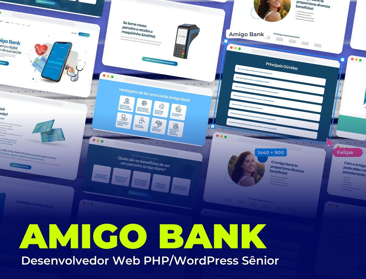 Amigo Bank
Context
Amigo Bank is a digital bank created to democratize access to healthcare, with credit and installment plans for appointments, tests and procedures and a network of partner clinics. I worked as Senior PHP/WordPress Web Developer, turning the layout into a WordPress site with a theme built in PHP.
Challenge
The same page had to convince patients to open an account and clinics to become partners, explain a financial product simply and be easy for the team to update, with benefits, partners and FAQs changing over time.
Development
A PHP WordPress theme built from scratch, faithful to the layout and responsive, with each section built as a reusable block.
Content editable from the admin panel: benefits, procedures, account steps, partner benefits, partners and FAQs are managed by the team, without relying on a developer.
Action buttons (simulate, request the card, become a partner, get the card machine, sign in and open an account) linked to the right destinations at each stage of the page.
The website, section by section
First the patient's journey, then the partner's, and finally account access and FAQs.
- 01 / 09
The top
"A digital bank that's a friend to your health": the promise next to the featured app, with the heart and stethoscope linking banking and health, and a single button, "I want a quote".
- 02 / 09
Account benefits
Eight benefits in cards with icons (credit paid directly to the clinic, 30 days to the first installment, financing in up to 24 installments, partner clinics across Brazil), so visitors understand the product in seconds.
- 03 / 09
What you can finance
From appointments and tests to surgery, dentistry and aesthetics, in two easy-to-scan columns, with a photo that brings out the human side of credit.
- 04 / 09
How to open an account
The step-by-step in five stages, from downloading the app to the digital card, with the physical card front and center and the "I want my card" button.
- 05 / 09
More benefits and partners
Consortiums, vehicle financing and FGTS birthday withdrawal extend the bank beyond healthcare, followed by the partners bar.
- 06 / 09
For clinics and hospitals
The audience shift: on a dark-blue background, the benefits of being a partner (get paid within 24 hours, expand payment options, build customer loyalty) and the "I want to be a partner" button.
- 07 / 09
The SAMPAG card machine
The card machine offer for partners, with the product front and center and a direct button to get one.
- 08 / 09
Get to know us and sign in
The brand and its purpose ("transparency and speed in service of everyone") and two action bars: sign in for existing customers and open an account for those who aren't yet.
- 09 / 09
Top questions
Questions about credit, limits, procedures and documents in a list that opens one answer at a time, before the footer.
Visual System
Financial-trust blues with healthcare aqua, which is also the color of the action buttons and the account access bar.
Palette
Sky Blue
#67BFFF
Benefits bar and highlights
Deep Blue
#124566
Headings, partners section and FAQ
Petrol Blue
#214F6D
Background of the clinics and hospitals section
Health Green
#4BB8A8
Buttons and the "I already have an account" bar
White
#FFFFFF
Section and card backgrounds
Takeaways
When a page speaks to two audiences, order solves it: first the larger group (patients), then a clear visual shift for the second (partners). And a well-structured WordPress theme lets the team grow the content without breaking the layout.
Other projects to explore.
 Legal
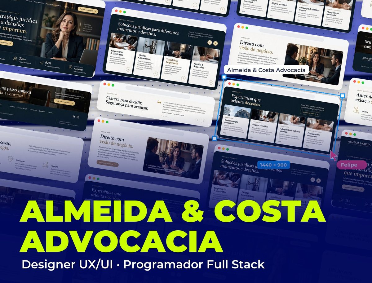
Almeida & Costa Advocacia
Corporate website with UI/UX and a PHP WordPress theme built from scratch
See project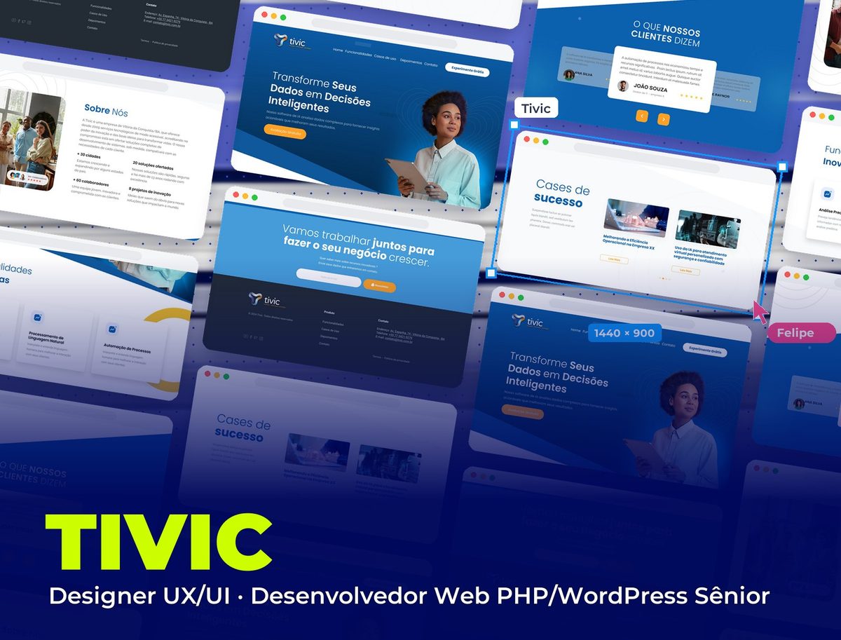 Technology & AI
Tivic
Corporate website for an AI software company
See project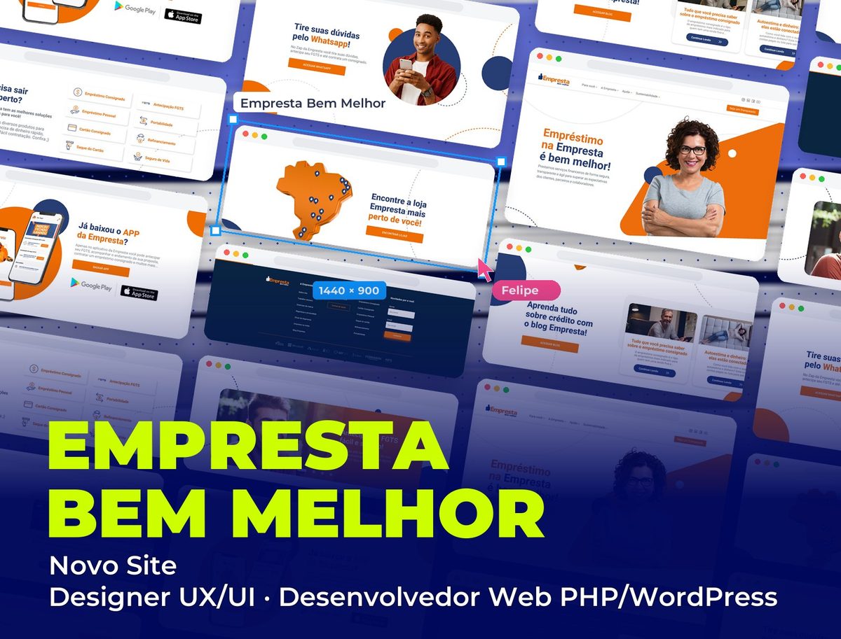 Fintech
Empresta Bem Melhor: Novo Site
New corporate website for the fintech, with UI/UX and WordPress development
See project