Fluency Academy: Gêmeas do Inglês
Sales page for the Gêmeas do Inglês BiEnglish course, with UI/UX and WordPress development
- My role
- UX/UI Designer · PHP/WordPress Web Developer
 Fluency Academy
Context
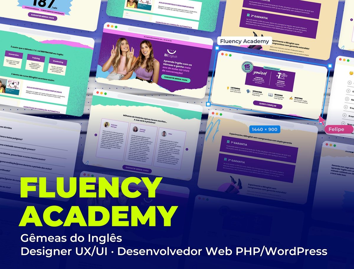
As Gêmeas do Inglês (the English Twins) are Fluency Academy teachers with a large social media following, and BiEnglish is their course, with recorded classes and live conversation classes. I did the UI/UX of the sales page and the WordPress development with a PHP theme.
Challenge
A course sales page carries a lot of information: method, classes, bonuses, testimonials, guarantees, price and FAQs. The challenge was to organize it all in the order people decide, keeping the twins' youthful energy and an always-clear path to enrollment.
The sales page, section by section
From the promise with the teachers to the FAQ, in the order people decide.
- 01 / 07
The top
The English Twins in the foreground on purple, with the BiEnglish logo and the direct promise: learn English with the twins and get half a year of live conversation classes. A single button: "Secure my spot".
- 02 / 07
The bonuses
The exclusive bonuses (months of live conversation classes and 7 free languages) in a highlighted badge, followed by the 4 skills the student will develop, each with an icon.
- 03 / 07
The method and the classes
"This is how the I.T.S. Method will unlock your English": immersion, training and shadowing in three cards, then what happens inside the course (easy classes, auto-graded exercises, shadowing) with real screens from the platform.
- 04 / 07
The stories
"Thousands of epic stories have been written": student testimonials with photo and name in a carousel, so visitors can picture themselves in their place.
- 05 / 07
The double guarantee
Two guarantees in purple cards (15 days to try it with a full refund and the results guarantee upon completing the schedule) and an extra block about the extended guarantee, to remove the fear of buying.
- 06 / 07
The offer
Everything included in a list on the left and the price highlighted on the right ("for just R$187 a month"), with the guarantee and free conversation months badges.
- 07 / 07
FAQ
More than 15 questions about scholarships, live classes, certificate, deadlines and support, in a list that opens one answer at a time before the footer.
Visual System
Purple, aqua and beige with torn edges, doodles and paper cutouts, for a long page that feels like a study notebook and carries the same energy as the twins' social media.
Palette
BiEnglish Purple
#641D85
Top, bonuses, guarantees and buttons
Aqua
#5CDAB7
Method background and highlights
Paper Beige
#F5E0B3
Guarantees and offer background
Sky Blue
#87C5EF
Price badge
White
#FFFFFF
Cards, testimonials and questions
Takeaways
A long sales page works when each section answers an objection at the right moment: first desire, then the method, proof, reassurance and only then the price. With the same button in every section, people decide when they're ready.
Other projects to explore.
 Edtech
Fluency Academy: Missão Inglês
Sign-up landing page for a free 7-day English challenge, with UI/UX and WordPress development
See project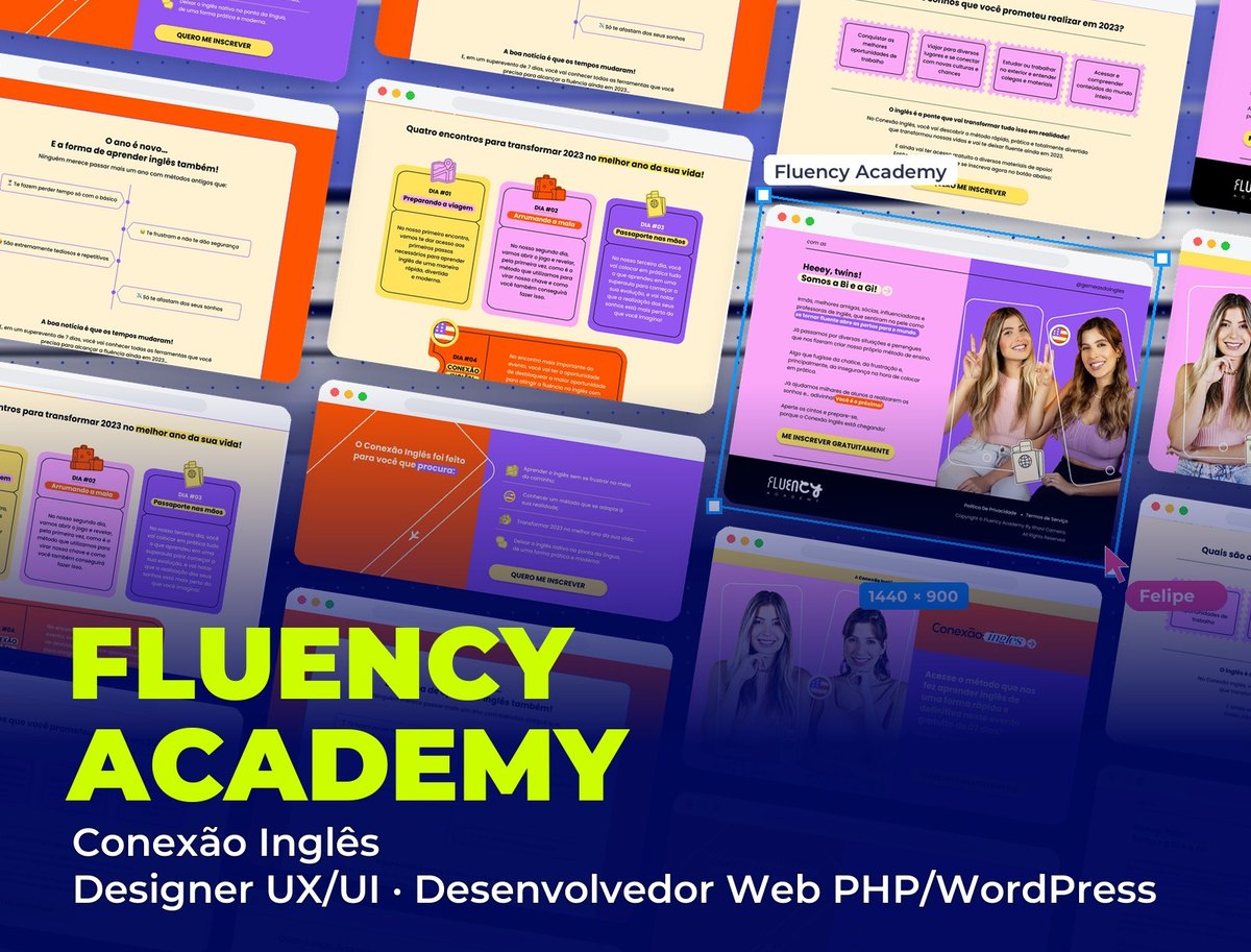 Edtech
Fluency Academy: Conexão Inglês
Sign-up landing page for the English Twins' free 7-day event, with UI/UX and WordPress development
See project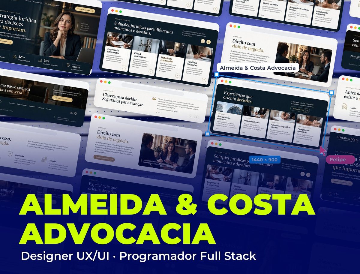 Legal
Almeida & Costa Advocacia
Corporate website with UI/UX and a PHP WordPress theme built from scratch
See project