Grande Hotel Araxá
Corporate platform and bookings
- My role
- UI Designer · Full Stack Developer
- Year
- 2022
 Grande Hotel Araxá
Context
A hotel group with two high-end products: Tauá Resort (leisure and corporate events) and Grande Hotel Araxá (a historic landmark hotel). Outdated websites in a market where the decision to book is strongly influenced by visual perception before the reservation.
Problem
The websites didn't convey the properties' real value. Underused images, a confusing information hierarchy and a multi-step booking flow with no feedback hurt conversion, especially on mobile, which already accounted for most searches.
Process
I audited the existing sites, mapping the booking flow from the user's point of view. I found that the biggest friction wasn't at checkout, it came earlier: users couldn't compare the available options clearly enough to decide to book.
I redesigned the visual hierarchy around hotel sales logic: spark desire first, back it up with information next, make conversion easy last. Large images and visual quality were treated as sales arguments, not decoration.
For Grande Hotel Araxá, the extra challenge was conveying its historic value without looking old-fashioned. The solution was to clearly separate the institutional storytelling from the booking journey: two different goals that shouldn't compete on the same screen.
The website, section by section
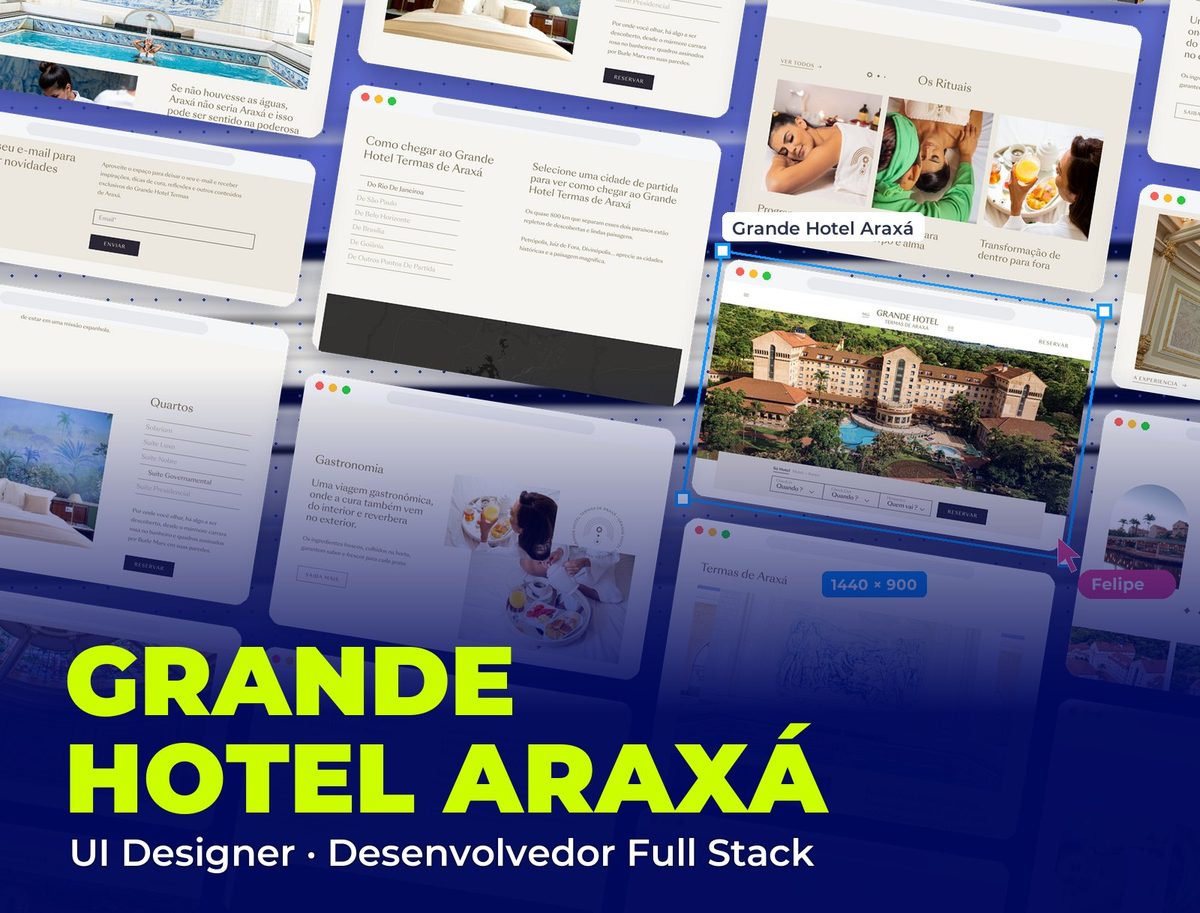
The Grande Hotel Termas de Araxá home page, from the facade to the newsletter sign-up.
- 01 / 09
The top
The historic facade seen from above fills the whole screen, and the booking search ("When?", "How many?") sits right below, without taking the spotlight from the hotel.
- 02 / 09
An experience of history and healing
The arched logo, inspired by the hotel's architecture, opens the "Experience of History and Healing" section, with a photo carousel and short texts about the architecture.
- 03 / 09
Rooms
Room categories in a list on the right, next to a photo of a room with its painted mural, and a direct button to book.
- 04 / 09
Dining
"A culinary journey, where healing also comes from within": photos of breakfast and service, with the hotel's seal, in an editorial layout.
- 05 / 09
The Araxá thermal baths
The tile mural over the thermal pool front and center and the line "Without the waters, Araxá wouldn't be Araxá", linking the spa to the city's history.
- 06 / 09
The rituals
The wellness programs (purification, body and soul, transformation) in three equal columns, with duration and benefits, for effortless comparison.
- 07 / 09
The stained glass
A visual pause with the hotel's ceiling stained glass at full width, a reminder that heritage is also part of the experience.
- 08 / 09
Getting here
A dark map with routes from the main cities: visitors choose their departure city and see the way to Araxá.
- 09 / 09
News
The close with the email sign-up for news and offers, in the same sober tone as the rest of the site.
Solution
Redesigned websites with a conversion-oriented visual hierarchy, a simplified booking flow and a mobile-first approach. Each property with its own identity within the same design system.
2
properties with their own identity
↓ Abandonment
reduction in booking flow abandonment
Full Stack
design + development delivered
Visual System
Grande Hotel Araxá required different typographic treatment from Tauá Resort: the historic hotel uses more Playfair Display in editorial elements to reinforce its heritage. The resort uses more Inter to convey modernity. Two products, one system, distinct personalities.
Palette
Sand
#ECE8DF
Section backgrounds: warmth and the stone tone of the historic hotel
Bronze
#84704D
Headings, ornaments and fine lines
Night Graphite
#2A2634
Booking buttons
Charcoal
#343331
Getting-here map background
Off-white
#F5F4F0
Cards and reading areas
Typography
Playfair Display
400 / 700
Headings and featured sections: an elegant serif that conveys history and sophistication
Inter
300 / 400 / 500
Interface, booking flow and practical information
Takeaways
In hospitality, the interface has to sell before it informs. The wrong order, informing before sparking desire, costs conversions even when the product is excellent.