Lúmina Estética Avançada
Clinic website with UI/UX and a custom WordPress theme
- My role
- UX/UI Designer · Full Stack Developer
 Lúmina Estética Avançada
Context
Lúmina is an advanced aesthetics and wellness clinic in Belo Horizonte that combines medical knowledge, technology and personalized care. I led the project end to end: from the interface concept and user experience to building the site in WordPress with a custom theme.
Problem
In aesthetics, the decision to book depends on three doubts: "does it work?", "is it for me?" and "can I trust them?". Generic clinic websites answer with a procedure catalog and stock photos. Patients leave without seeing real results or understanding what the care would be like.
Goal
Create a website that answered the three doubts in the order they arise, with an aesthetic worthy of the clinic (sophisticated, natural and welcoming), leading effortlessly to booking a consultation from any point on the page.
Process
A hero with promise and tone: "Real beauty at every stage.", with a single button ("Book my consultation") and, right below, four differentiators in thin-line icons: natural results, advanced technology, personalized care and a specialized team.
"Does it work?": the first section after the hero is "Real results", with a side-by-side before-and-after carousel. The proof comes before any explanation of procedures.
"Is it for me?": the six specialties (Facial Harmonization, Skin Treatments, Rejuvenation, Body Treatments, Healthy Weight Loss and Health & Wellness) appear in cards with a photo, a plain-language summary and a link to each treatment's page.
"Can I trust them?": the "About the clinic" section introduces the medical director and the commitments of the care (safe protocols, a welcoming environment, follow-up at every stage). Next, "From diagnosis to results" explains the journey in four steps (assessment, planning, treatment and follow-up), and patient testimonials close the proof.
Full stack development: I built a custom WordPress theme, responsive and faithful to the layout. Treatments, results, testimonials and blog posts are managed from the admin panel, so the clinic updates the site on its own. The booking button stays fixed in the menu, the final "Book your consultation" section reinforces the invitation and the clinic's contact details sit in the footer. Being the same person in design and code kept the interface polish intact in the published version.
The website, section by section
Promise, proof, treatments, trust and invitation, in that order.
- 01 / 07
The top
"Real beauty at every stage", with a single button to book a consultation and four differentiators in thin-line icons right below.
- 02 / 07
Does it work?
The first section after the top is already the before-and-after, in a side-by-side carousel. The proof comes before any explanation of procedures.
- 03 / 07
Is it for me?
The six specialties in cards with a photo and a simple summary, so patients recognize their own goal and move on to the right treatment.
- 04 / 07
Can I trust them?
The medical director front and center and the commitments of the care (safe protocols, a welcoming environment, follow-up at every stage).
- 05 / 07
What the care is like
"From diagnosis to results": the journey in four steps (assessment, planning, treatment and follow-up), with no surprises.
- 06 / 07
Who's been there
A patient testimonial with photo and name, reinforcing trust right before the invitation.
- 07 / 07
The invitation
"Book your consultation" in a dark, welcoming section with the clinic's interior in the background, and the contact details in the footer.
Visual System
Nude, cream and brown for an aesthetic that speaks of skin, naturalness and care. The serif type in headings adds sophistication, and brown is reserved for buttons and the booking section, where the decision happens.
Palette
Coffee
#2E1506
Headings and main text
Caramel
#946F49
Primary buttons, such as "Book my consultation"
Chocolate
#463728
"Book your consultation" section
Nude
#EDD6B9
Button on dark backgrounds
Cream
#F8F6F3
Section and card backgrounds
Takeaways
In aesthetics, the website has to answer patients' doubts in the order they have them: first the result, then the treatment, finally trust in the team. In that order, the invitation to book a consultation feels like the natural next step, not a sales pitch.
Other projects to explore.
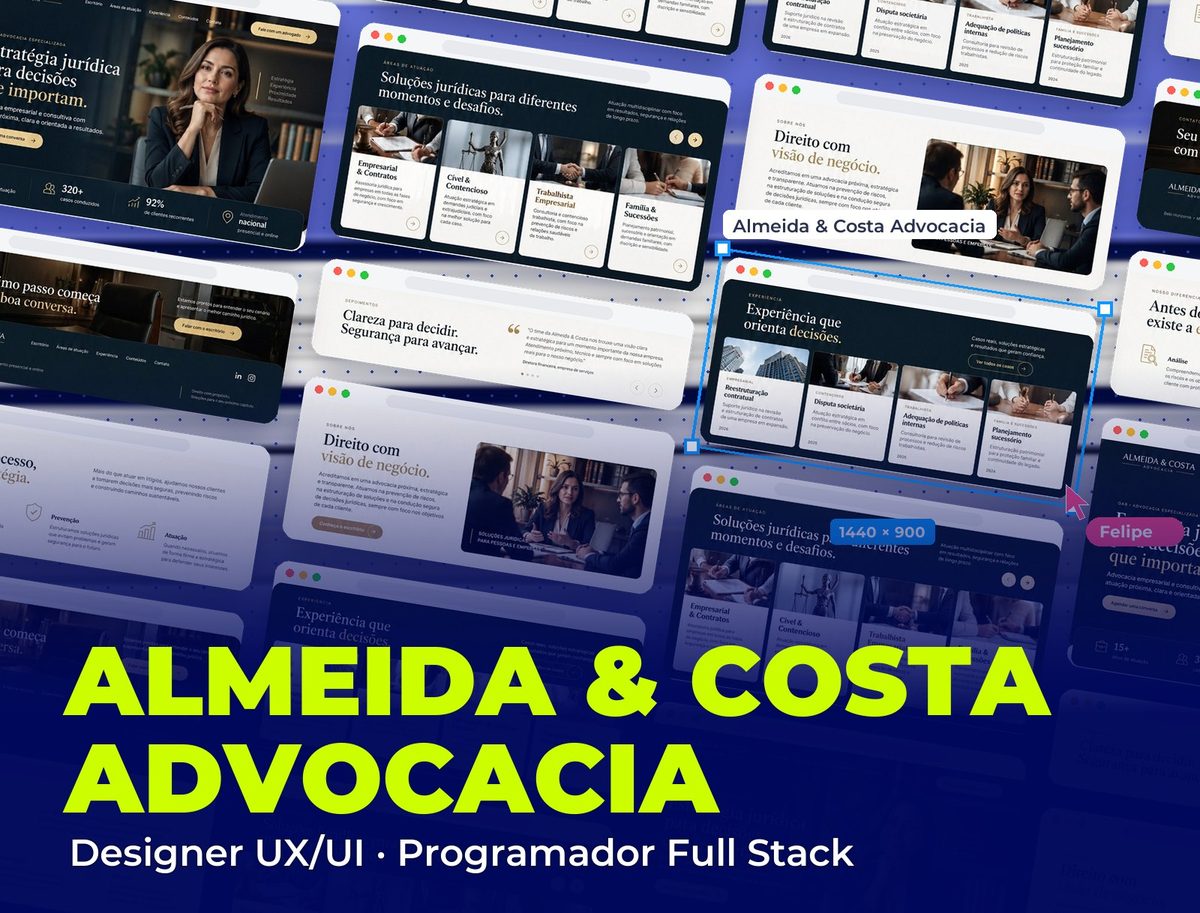 Legal
Almeida & Costa Advocacia
Corporate website with UI/UX and a PHP WordPress theme built from scratch
See project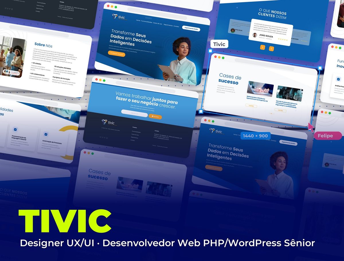 Technology & AI
Tivic
Corporate website for an AI software company
See project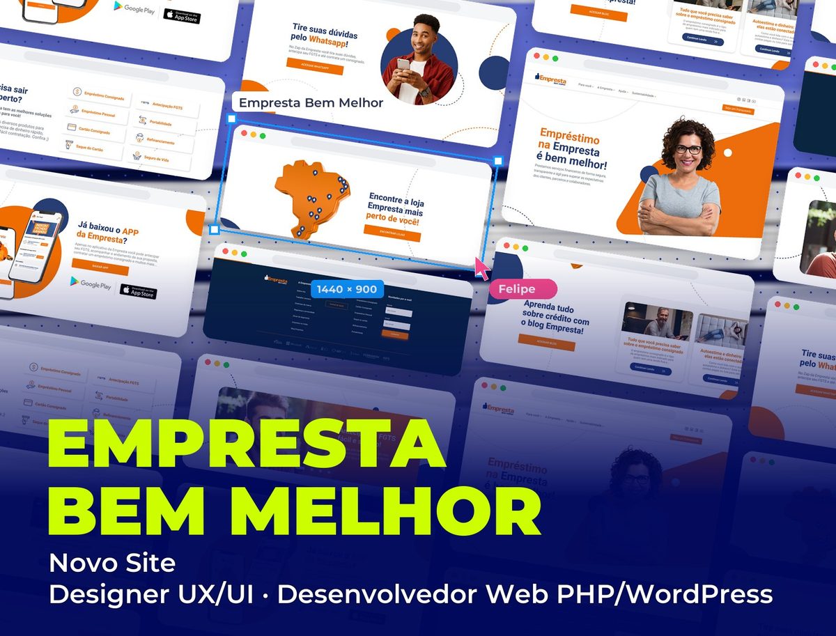 Fintech
Empresta Bem Melhor: Novo Site
New corporate website for the fintech, with UI/UX and WordPress development
See project