Samarco
Landing pages for the Reparation Agreement, with UI/UX and a PHP WordPress theme
- My role
- UX/UI Designer · Senior PHP/WordPress Web Developer
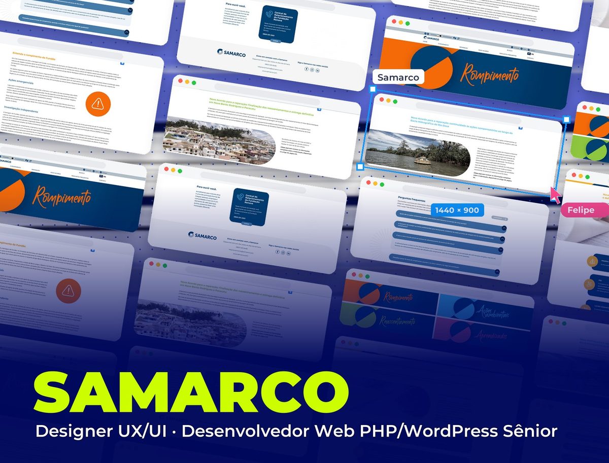 Samarco
Context
Samarco needed pages to communicate the new Reparation Agreement for the Fundão dam collapse. I worked as Senior UX/UI Designer and PHP/WordPress Web Developer: I designed the landing page interface and built everything in PHP as a WordPress theme.
Challenge
The subject is sensitive and the audience is broad: affected people, communities, the press and public agencies, with very different levels of digital familiarity. The pages had to explain facts, programs and deadlines clearly and respectfully, be accessible to everyone and let the team update content without relying on a developer.
Process
A single structure: every page follows the same order (topic header, plain-language explanation, visual highlights, FAQ and support channels). Once you learn to read one page, you can read them all.
One color per topic: the visual system starts from Samarco's navy and gives each topic of the agreement its own color, applied to the header, headings and highlights.
Accessibility from the start: a bar with font size control, high contrast, Libras (Brazilian Sign Language) and keyboard shortcuts, plus an English version.
PHP development for WordPress: a custom theme, faithful to the layout and responsive, where text, FAQs and programs are managed from the admin panel.
The pages, section by section
From the accessible header to the support channels, through the topics of the agreement.
- 01 / 08
Accessible header
Before the menu, an accessibility bar with font enlargement, high contrast, Libras and shortcuts to Content, Menu and Footer, plus a language switch (PT/EN). On a subject affecting thousands of people, no one can be left out.
- 02 / 08
A color for each topic
Collapse (orange), Environmental actions (blue), Resettlement (green) and Lessons learned (pink): the same header with the brand circle and the handwritten title, changing only the color. Visitors know which topic they're in without reading the menu.
- 03 / 08
The collapse
The page that opens the subject tells the facts in order: what happened at Fundão, the emergency actions and the independent investigation, with short headings and an alert icon for the most sensitive part.
- 04 / 08
Environmental actions
What the new agreement provides for the Rio Doce basin, with a photo of monitoring on the river and the curved cutout repeated on every page, linking text and image.
- 05 / 08
Resettlement
The final handover of Novo Bento Rodrigues and Paracatu, with an aerial photo of the houses and the agreement's numbers alongside, always with a link to the full information.
- 06 / 08
Compensation
The most visited page organizes each program (PIM/SPA, PID, Lost Profits, AFE and Novel) in cards with an icon and summary, and a yellow alert makes clear who is not eligible, avoiding confusion and frustration.
- 07 / 08
FAQ
On every page, the topic's questions with a category filter and answers that open one at a time. The question gets answered right there, without having to call.
- 08 / 08
We're here to listen
Every page ends with the support channels: the Fundação Renova help center front and center and, in the footer, Samarco's 24-hour toll-free number, email and social media.
Visual System
Samarco's navy is the base of every page; each topic of the agreement gets its own color, applied to the header, headings and highlights, to guide visitors without relying on the menu.
Palette
Samarco Blue
#003463
Base of every page: header, cards and footer
Collapse Orange
#F46A08
Collapse page
Environmental Blue
#3FC8F4
Environmental actions page
Resettlement Green
#8EC63F
Resettlement page
Lessons Pink
#DC6A84
Lessons learned page
Compensation Yellow
#F4B02B
Compensation page and alerts
Takeaways
When communicating sensitive subjects, clarity is respect. A predictable structure, plain language and real accessibility do more for trust than any visual effect.
Other projects to explore.
 Fintech
Empresta Bem Melhor: Manutenção Automotiva
FGTS advance landing page for car maintenance, with UI/UX and WordPress development
See project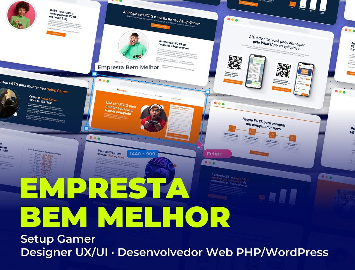 Fintech
Empresta Bem Melhor: Setup Gamer
FGTS advance landing page for building a gaming setup, with UI/UX and WordPress development
See project Edtech
Fluency Academy: English Mode On
Sign-up landing page for a free English week in Latin America, with UI/UX and WordPress development
See project