Tivic
Corporate website for an AI software company
- My role
- UX/UI Designer · Senior PHP/WordPress Web Developer
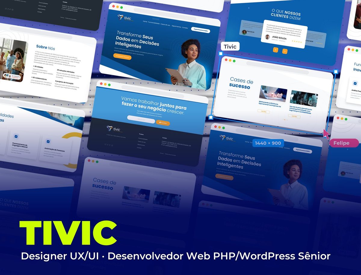 Tivic
Context
Tivic is a technology company from Vitória da Conquista (Bahia), in the market since 2009, that builds AI software to turn data into decisions. I designed the interface and experience of the institutional website and built it in WordPress with a custom PHP theme.
Challenge
AI software is usually sold with technical terms decision-makers don't understand. The website had to show the product's value in business language, prove there's a solid company behind it and lead visitors to request an assessment.
The website, section by section
From the promise at the top to the final invitation, each section answers a question from someone evaluating the product.
- 01 / 06
The top
"Turn your data into smart decisions": the promise talks about results, not technology. A single orange button, "Free Assessment", and "Try it Free" fixed in the menu.
- 02 / 06
Features
Predictive analytics, natural language processing and process automation in three identical cards, each with a sentence about what changes for the customer.
- 03 / 06
Success stories
Use cases in a carousel, with an image and a results-oriented title (operational efficiency, virtual customer service), so visitors can picture themselves as the customer.
- 04 / 06
About us
The company behind the product: the team in a real photo and four proof points (cities served, employees, solutions offered and innovation projects).
- 05 / 06
What customers say
Testimonials in a carousel with the center card highlighted, name, title and stars, on the brand blue.
- 06 / 06
Let's work together
The final invitation in one big sentence and an email field with an orange button, followed by the footer with product, contact and social links.
Visual System
Tech blues in gradients, with diagonal cuts between sections and wave lines in the background, and orange reserved for action buttons so the path to contact stands out.
Palette
Deep Blue
#094E8E
Top, testimonials and gradients
Tivic Blue
#0C61AF
Headings and highlights
Light Blue
#459CD9
Contact bar
Action Orange
#FFA126
Assessment and newsletter buttons and arrows
Graphite
#232C35
Footer
Takeaways
Technology buyers buy results. When the website swaps the name of the technique for the benefit (better decisions, faster service, automated processes), the product stops looking complicated and starts looking necessary.
Other projects to explore.
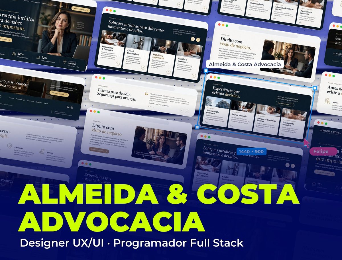 Legal
Almeida & Costa Advocacia
Corporate website with UI/UX and a PHP WordPress theme built from scratch
See project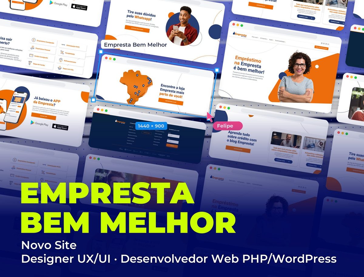 Fintech
Empresta Bem Melhor: Novo Site
New corporate website for the fintech, with UI/UX and WordPress development
See project Healthcare & Aesthetics
Lúmina Estética Avançada
Clinic website with UI/UX and a custom WordPress theme
See project