Coral Tintas
Creative direction and UI/UX for all campaign media
- My role
- Senior UI/UX Director
- Year
- 2026
 Coral Tintas
Context
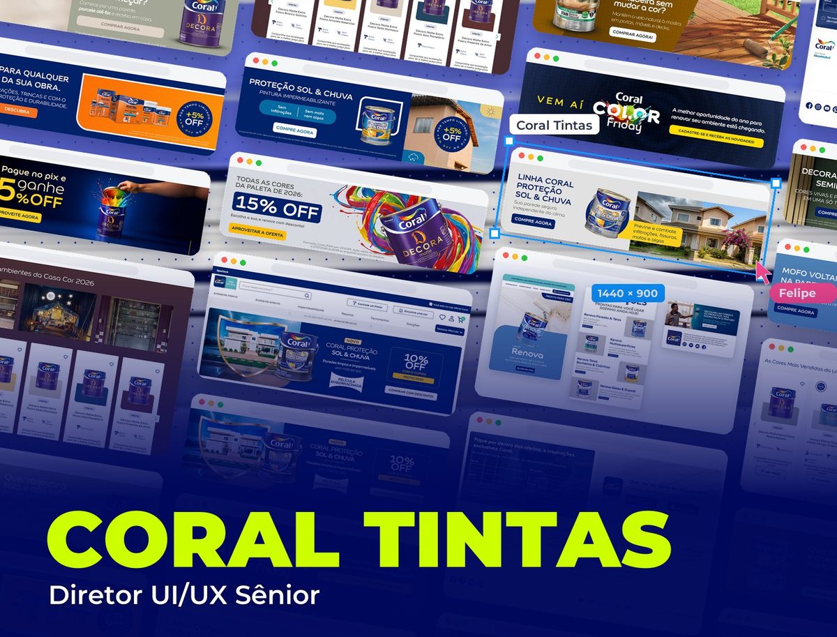
Coral is one of Brazil's leading paint brands. The project is the creative direction and UI/UX of all campaign media: e-commerce banners, email marketing and social media, an ongoing body of work, not a one-off piece.
Challenge
The e-commerce runs several campaign fronts at once: the color of the year launch, a preview of the next year's palette, discount promotions, product categories and relationship events. Each campaign needs a complete media set, site banners, email marketing and social media, communicating the same offer across different formats and channels without losing consistency or becoming rework with every new piece.
The store, section by section
The Coral Official Store home page, where the campaign banners come to life.
- 01 / 04
Top and main banner
The top of the Coral Official Store on VTEX: search, shortcuts to hire a painter and find a color, a menu by room and the 5% off with Pix bar. Right below, the home banner carousel, where the week's campaigns go.
- 02 / 04
Showcases by need
After the banner, the showcases organize products by the problem to solve (best-selling colors, exterior walls, enamels, floors), with each product's color highlighted on the card and attributes as icons.
- 03 / 04
Inspiration: Casa Cor 2026
An inspiration block with the Casa Cor rooms and the colors used in each, so people still choosing a color leave the site with the right product.
- 04 / 04
Newsletter, app and footer
Sign-up for offers by email and WhatsApp, the invitation to the Coral Visualizer app (see the color on your own wall) and the footer with policies, help and the retailer area.
Home page banners
A selection of banners created for the home carousel across campaigns: launches, product lines, dates and Pix discounts. They all follow the same structure (short headline, one-line benefit, featured product and a button), with color and image changing each campaign so the carousel never feels repetitive.
Email marketing
Renova Line email: pre-header with the promise, navigation matching the store, a hero with the product, the line's four solutions alternating image and text, each with a "Get it delivered" button, and a block to hire a certified painter before the footer.
Solution
Creative direction and UI/UX for all media in each campaign: e-commerce banners (home, categories and product pages), email marketing and social media. A single hierarchy system for headline, offer and CTA, adapted to each channel's format, with a specific palette per campaign type within the brand's visual standard.
3 channels
covered per campaign: website, email marketing and social media
4 fronts
of campaigns: color, product, promotion and event
1 system
of hierarchy adapted to each format and channel
Visual System
Instead of a fixed palette, the system defines one color per campaign type over the brand's white base: earthy green for color launches, red for products (strength and purchase urgency), deep blue for categories and relationship campaigns. This keeps each channel varied without losing the hierarchy pattern between headline, offer and CTA.
Palette
Natural Stone Green
#6B7355
Color of the year launch and trend palettes
Earthy Beige
#D8CBB8
Inspiration pieces and color combinations
Coral Master Red
#C41E3A
Product banners: urgency and call to buy
Deep Blue
#1B2A5E
Product categories and relationship events
White
#FFFFFF
The e-commerce base, where the banners rotate
Typography
Display Bold
Bold / Black
The offer headline on each banner, always the largest piece of text
Sans UI
Regular / Semibold
Supporting text, CTA and e-commerce navigation
Takeaways
Campaign media isn't a one-off piece, it's a system: when the same launch runs on a banner, email and social media at the same time, hierarchy consistency (where to look first, what the offer is, where the CTA is) matters more than any single beautiful piece. Creative direction comes in exactly at that point, ensuring every new piece, on any channel, follows the same reading pattern as the ones before it.