Fluency Academy
Concept and creative direction of the "Intensive English" campaign
- My role
- Creative Director · UI Designer
- Year
- 2022–2023
 Fluency Academy
Context
Fluency Academy is Rhavi Carneiro's intensive English school, with cohort-based enrollment (sign-ups open and close by period). I worked as a freelancer directly for the client, first as a UI Designer creating landing pages and email marketing, then conceiving and creatively directing the 'Intensive English' campaign.
Problem
Language courses are a saturated category: everyone has seen ten similar English course offers this week. Without real urgency and a recognizable visual system, the campaign gets lost in the feed before converting.
Goal
Create a campaign with genuine urgency (spots per cohort, not unlimited spots) and a visual system strong enough to be recognized in any format, from the landing page to an Instagram post, without relying only on discounts to convert.
Process
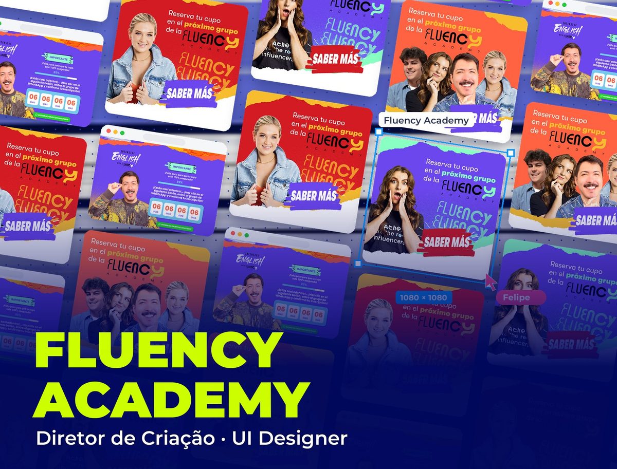
On the landing page, the urgency is literal, not decorative: a day countdown, a progress bar showing 85% of spots filled and a single CTA (join the WhatsApp group) repeated at the top and bottom of the page. No long form — conversion happens on WhatsApp, where the team closes the enrollment.
For social media, I defined a 'torn paper' visual system: color strips with irregular edges, like pieces of paper glued on, with the 'Saber más' badge always in the same spot in the composition. It's a simple device that works in any color palette (red, orange, purple) without losing the piece's identity.
Each social piece combines a real photo of a student or a testimonial with the same text structure: a call to the next cohort + the Fluency Academy wordmark. The repeated structure is intentional: anyone who's seen one piece recognizes the next before reading it.
Featured pieces
The campaign landing page and social media pieces in the same 'torn paper' visual system.
Solution
A campaign with real urgency (spots per cohort) and a torn-paper visual system recognizable in any format and color palette, from the conversion landing page to the social media pieces, without relying only on discounts to close enrollments.
Takeaways
Genuine urgency converts more than decorative urgency: a countdown only works when spots really run out. And a simple, repeatable visual system (the paper cutout, the badge in the same spot) builds more brand recognition than a new pretty piece in every post.