Aperam
Concept and creative direction of the "Se é pra vida" institutional campaign
- My role
- Creative Director
- Year
- 2023–2024
 Aperam
Context
Aperam is one of the world's largest stainless steel producers, with significant operations in Minas Gerais. As Creative Director, I conceived and directed an institutional campaign to bring the brand closer to the general public, a project developed while I was Art Director at Kind Branding.
Problem
Stainless steel is everywhere (industry, architecture, appliances, cars) but it's perceived as a technical input, not something people associate with values or moments in their own lives. Institutional communication in the category tends to talk about technical specs, not meaning.
Goal
Create a campaign concept that translated stainless steel's technical attributes (strength, durability, versatility) into desirable human qualities, anchored in real everyday scenes from different audiences, without relying on technical language.
Process
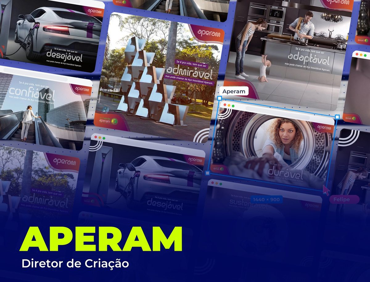
I started from a simple question: which qualities do we value in life that Aperam stainless steel also has? I came up with six: sustainable, reliable, durable, admirable, adaptable and desirable. Each became its own piece, with the structure "If it's for life, it has to be [quality], but you can call it Aperam Stainless Steel", connecting the human value to the product's technical name in the same sentence.
Each attribute was anchored in a real, recognizable scene, not an abstract metaphor: sustainable is the worker on the factory floor, reliable is the corporate environment, durable is the appliance in everyday home use, adaptable is a family's kitchen, desirable is the high-end car. The idea was that anyone, from any audience, would recognize their own life in at least one of the six scenes.
For "admirable", instead of a new piece created from scratch, I directed the campaign's application onto an existing public stainless steel sculpture, repositioning a real work of art as concrete proof of the material in a more admirable, less industrial reading.
I designed a single identity system for the campaign: a continuous-stroke, outlined typeface for each piece's keyword, applied over real photography (not illustration), with the brand and the Aperam Green Steel program seal on every piece, so the campaign was recognizable in any format, from a square post to an institutional banner.
Featured pieces
The campaign's six pieces, each anchoring an attribute of stainless steel in a real, recognizable scene.
Solution
A six-piece institutional campaign, unified by a single verbal concept and a single visual system, able to run on social media, in institutional media and even on a real physical piece. Stainless steel stops being a technical spec and becomes associated with qualities people already value in their own lives.
Takeaways
Communicating a technical material to the general public works better when the message starts from people's lives, not from the product's spec sheet. Anchoring each attribute in a real, specific scene (rather than a generic illustration) is what gave the concept credibility: anyone recognizes the kitchen, the car or the office, even without knowing anything about metallurgy.