Tauá Resort
Corporate platform and bookings
- My role
- UI Designer · Full Stack Developer
- Year
- 2022
 Tauá Resort
Context
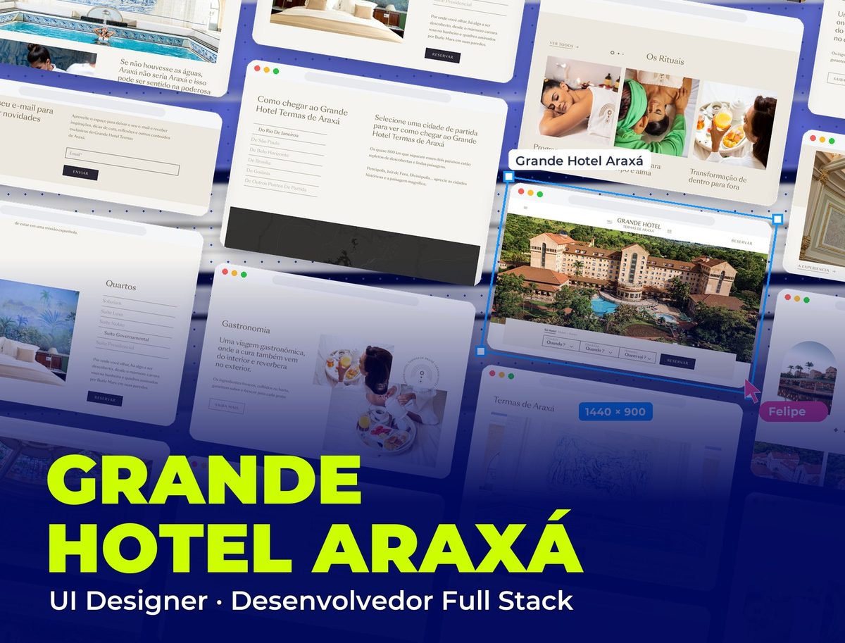
A hotel group with two high-end products: Tauá Resort (leisure and corporate events) and Grande Hotel Araxá (a historic landmark hotel). Outdated websites in a market where the decision to book is strongly influenced by visual perception before the reservation.
Problem
The websites didn't convey the properties' real value. Underused images, a confusing information hierarchy and a multi-step booking flow with no feedback hurt conversion, especially on mobile, which already accounted for most searches.
Process
I audited the existing sites, mapping the booking flow from the user's point of view. I found that the biggest friction wasn't at checkout, it came earlier: users couldn't compare the available options clearly enough to decide to book.
I redesigned the visual hierarchy around hotel sales logic: spark desire first, back it up with information next, make conversion easy last. Large images and visual quality were treated as sales arguments, not decoration.
For Grande Hotel Araxá, the extra challenge was conveying its historic value without looking old-fashioned. The solution was to clearly separate the institutional storytelling from the booking journey: two different goals that shouldn't compete on the same screen.
The website, section by section
The Grupo Tauá Hotéis home page, from the emotion at the top to the deals.
- 01 / 06
The top
A father and son at the water park fill the whole screen: the site opens by selling the emotion of the trip. The booking search (destination, check-in, check-out and guests) floats over the photo, one click away.
- 02 / 06
Promotional packages
Packages in a carousel, with the open offer highlighted in orange ("Couple + 2 kids free", from 10x R$299) and badges for Pix discounts and view counts that create urgency.
- 03 / 06
Family moments
"Unforgettable family moments": a card with the group's promise and its five destinations, set on a real photo of a family at the park.
- 04 / 06
Experience gallery
Full-screen photos of activities at the resorts, with captions and a counter ("1/10"), so visitors can picture their own stay.
- 05 / 06
Experiences for all ages
Dining, kids' recreation and spa in a carousel showing there's something for everyone in the family.
- 06 / 06
Deals and footer
The green sign-up bar to receive deals and the footer with the group's destinations, booking channels and support hours.
Solution
Redesigned websites with a conversion-oriented visual hierarchy, a simplified booking flow and a mobile-first approach. Each property with its own identity within the same design system.
2
properties with their own identity
↓
Less abandonment in the booking flow
Full Stack
design + development delivered
Visual System
Grande Hotel Araxá required different typographic treatment from Tauá Resort: the historic hotel uses more Playfair Display in editorial elements to reinforce its heritage. The resort uses more Inter to convey modernity. Two products, one system, distinct personalities.
Palette
Tauá Orange
#EC6726
Buttons, featured offer and carousel arrows
Pool Blue
#449DD7
Promotional packages bar
Tauá Green
#00983A
Headings, logo and deals bar
Sun Yellow
#FFCD00
Playful curves and shapes along the edges
White
#FFFFFF
Card and content section backgrounds
Typography
Playfair Display
400 / 700
Headings and featured sections: an elegant serif that conveys history and sophistication
Inter
300 / 400 / 500
Interface, booking flow and practical information
Takeaways
In hospitality, the interface has to sell before it informs. The wrong order, informing before sparking desire, costs conversions even when the product is excellent.