Achieve Idiomas
Creative direction and visual identity
- My role
- Creative Director
- Year
- 2022
 Achieve Idiomas
Context
A language school focused on English and other languages, competing for students with large digital platforms that spend far more on marketing than a local school can.
Problem
Without a consistent visual identity, enrollment campaigns got lost in saturated feeds. Each campaign looked like it came from a different school: not enough recall to convert people who were still comparing options.
Process
I defined the brand's visual territory around aspiration and results: students don't buy a language, they buy what the language will open up for them. The visual language was built around that: people on the move, international settings, achievement.
I created a system of pieces for different campaign contexts (enrollment, educational content, holidays) with controlled variations the in-house team could replicate without needing creative approval for every post.
Pieces
A sample of the system applied to different campaign contexts: educational content, enrollment, exchange programs and holidays.
Solution
A defined visual identity and a scalable communication system for enrollment campaigns, social media and exchange program communication. Templates the in-house team can replicate.
6+
campaigns developed
Independent
team replicating without an agency
↑
Enrollments converted by the campaigns
Visual System
The system was designed so the school's in-house team could execute it without needing creative approval. That meant creating a "when to use what" guide: purple for institutional, pink for immediate action, yellow for celebration. Each color with a clear role.
Palette
Aspiration Purple
#5B21B6
Primary color: knowledge, international aspiration, modernity
Active Pink
#DB2777
Energy, conversion, high-urgency enrollment campaigns
Achievement Yellow
#FCD34D
Positivity, celebration, exchange and achievement badges
Dark
#111827
Background for featured sections and strong hierarchy
Light Gray
#F3F4F6
Default background, breathing room and educational posts
White
#FFFFFF
Cleanliness and contrast in vibrant compositions
Typography
Poppins
600 / 700 / 800
Campaign headlines: modern, friendly, aspirational. Typically used for enrollment headlines
Inter
400 / 500
Body text, course information and educational content
Takeaways
Smaller schools don't win through volume of communication, they win through consistency. An identity the team itself applies correctly is worth more than brilliant one-off campaigns that can't be sustained day to day.
Other projects to explore.
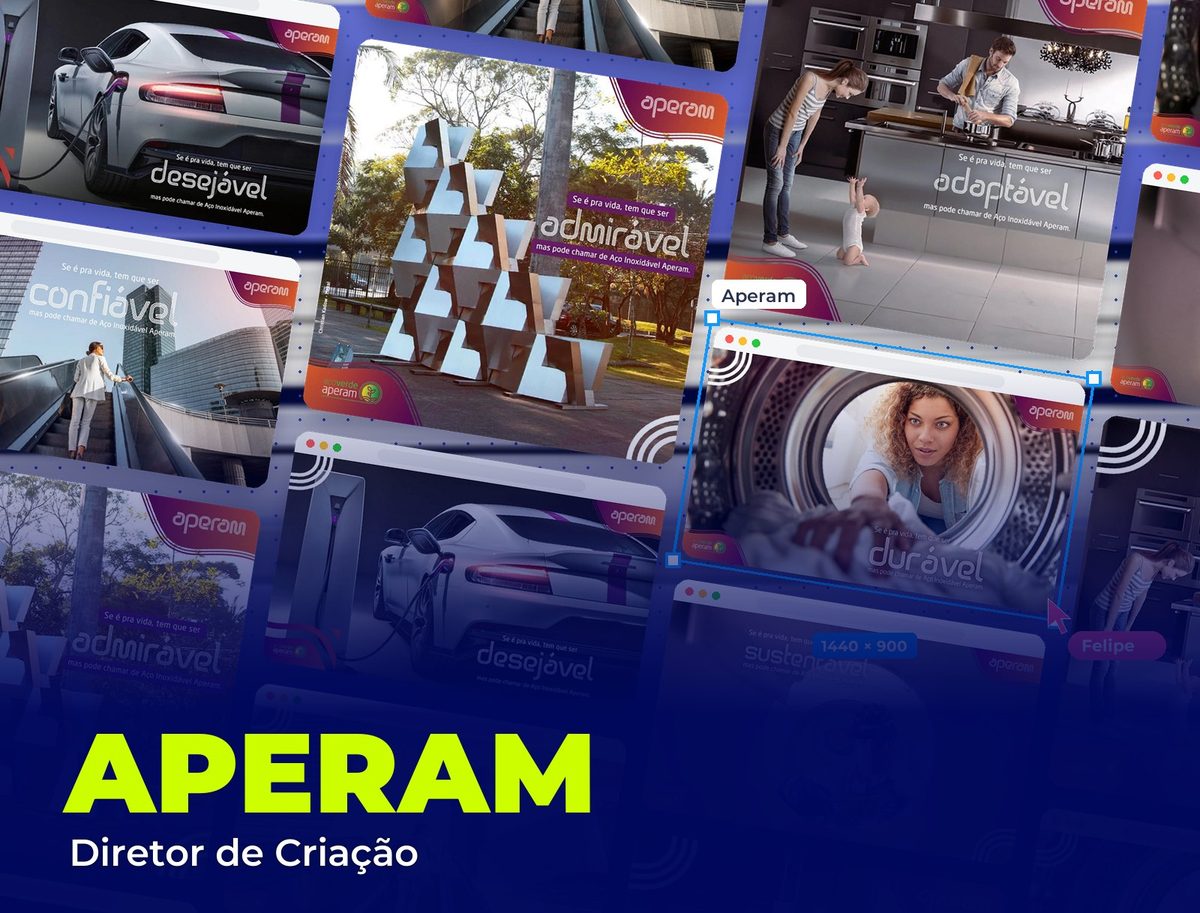 Institutional & Sustainability
Aperam
Concept and creative direction of the "Se é pra vida" institutional campaign
See project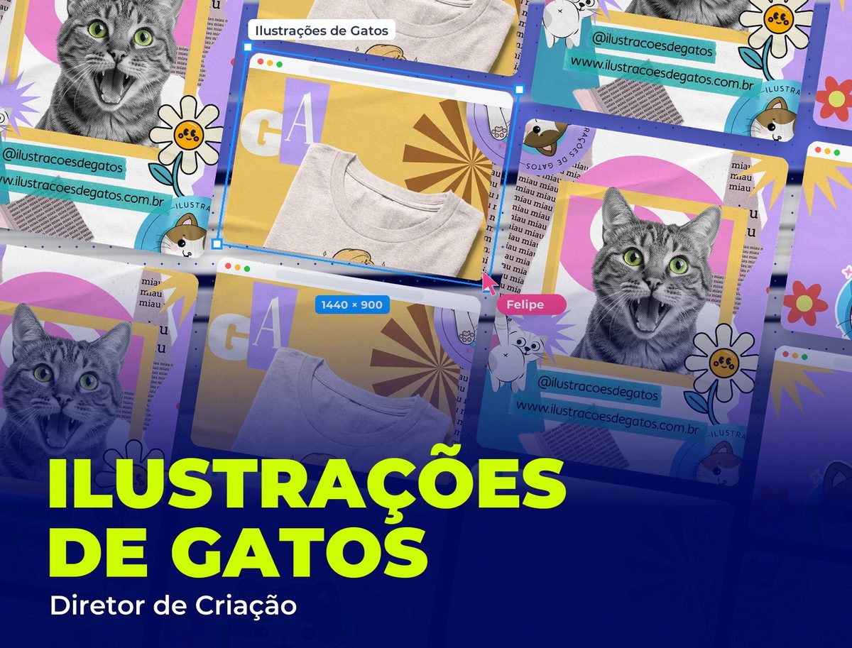 Brand & Content
Ilustrações de Gatos
Brand creative direction: character, content and products
See project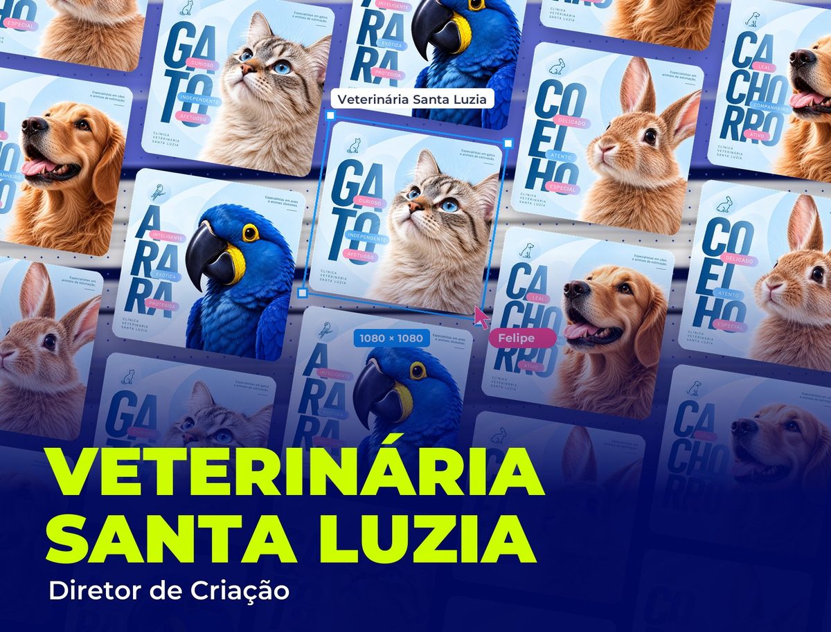 Healthcare & Pet
Veterinária Santa Luzia
Creative direction of social media for a pet clinic
See project